Symbol Mark
Predicting the results by betting on games you are most confident with!
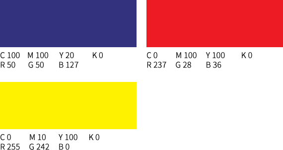
The BI of Proto, a new type of betting game made up of diverse themes, is tantamount to forecasting the game results. Target, which means hitting the mark, is used as a basic design factor. Target is a symbolic factor in which the general public can easily recognize, appealing the proto type, which is accessible to anyone, in an indirect way. In terms of its pattern, from each letter, which seems simple and clear, P and O with consistent forms were used repetitively, accentuating both formative consistency and visual rhythm. The colors of Proto—dark blue, red, and orange—which coincides with the representative colors of Toto, implies the succession of Toto’s loyalty and the definition and selection of colors in a betting game category.


